
Time Series Analytics
Compare question responses over time aggregated by either Day, Week or Month.
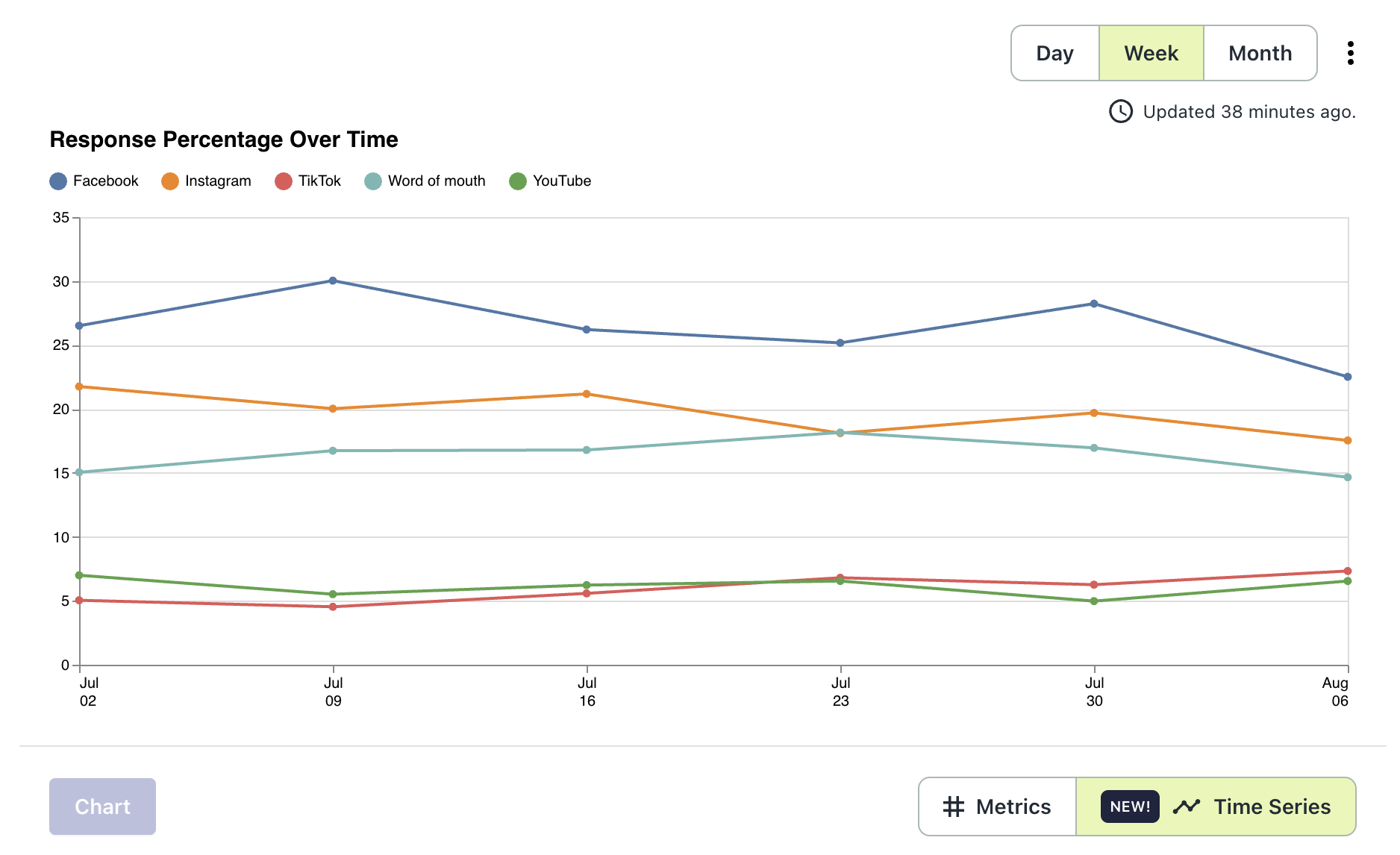
The 'Time Series' button on the Analytics tab will switch your view from the usual metrics shown (Responses, Views, Response Rate) to a line graph of your top 5 responses charted over time. The X axis shows response percentage and the Y access shows the order date associated with the response.
The graph automatically refreshes every 30 minutes. You can see when the last refresh was below the Day/Week/Month picker.
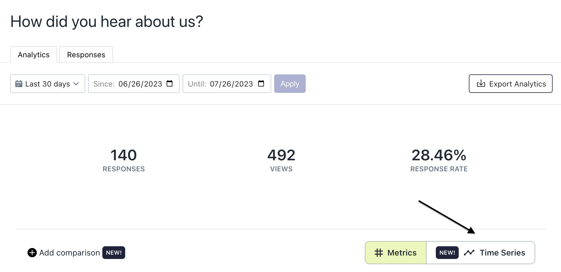
Click Time Series button
Time Series Graph
The time range is dictated by the date picker fields at the top of the screen. You then have the option to aggregate the data by Day, Week or Month within that time range. A tooltip is available when hovering over each available data point to summarize the data shown for that aggregation bucket.
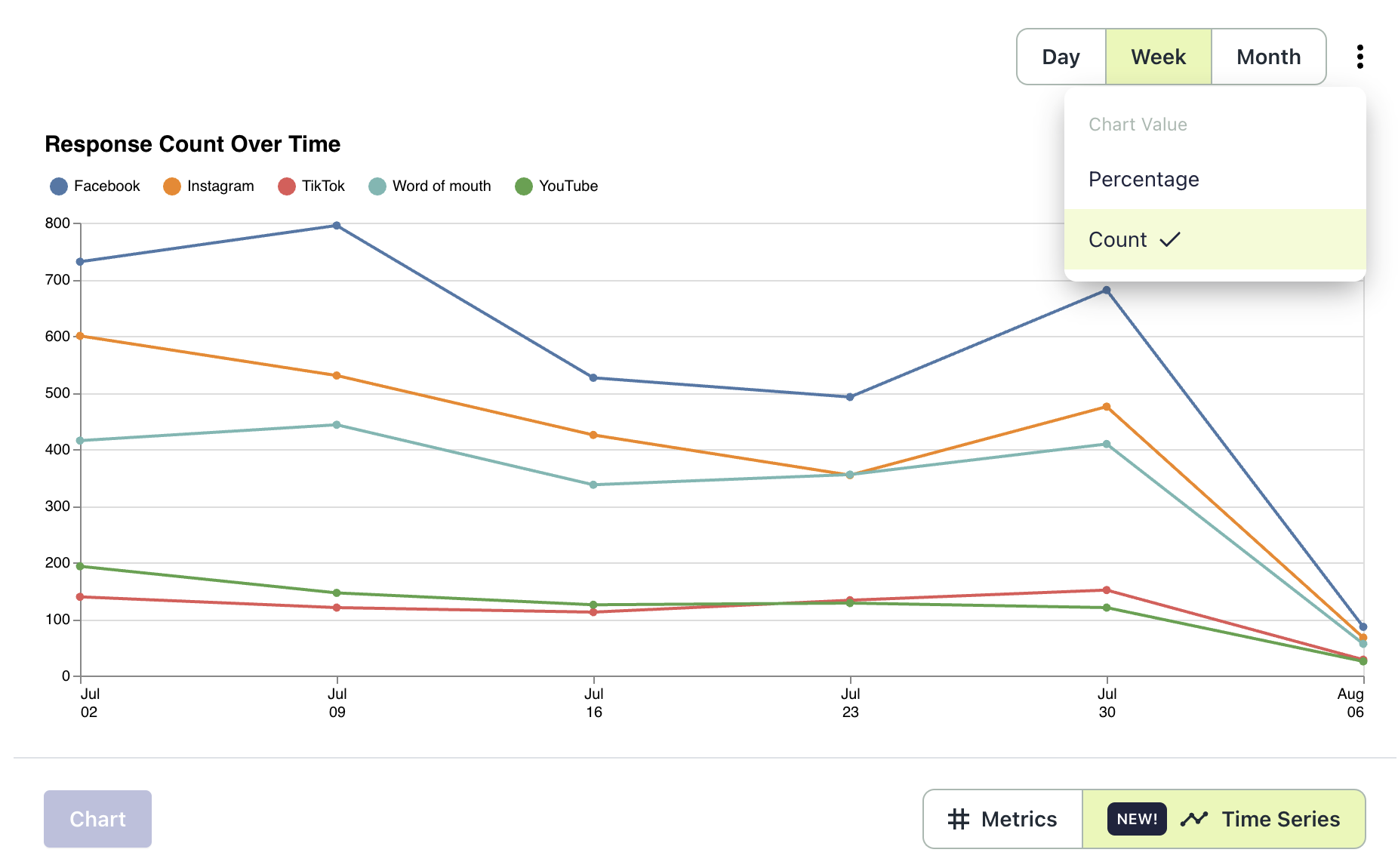
Chart Values
By default, the chart will show responses as a percent over time, but you have the option to switch the chart to show response count over time as well. To do so, click the kebab menu next to the aggregation buckets and select count.
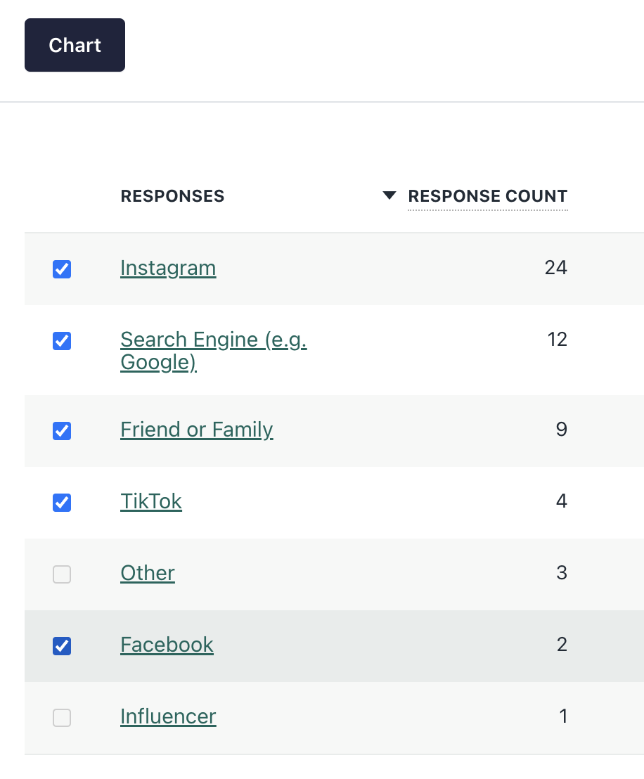
Charting Responses
The default state for the time series graph will be that your top 5 responses (by volume) are charted, but you can chart whichever 5 responses (or less than 5 responses) you want to see. To chart different responses, first unselect at least one response from the already charted responses, select your desired response and click the 'Chart' button. The responses selected will now be the responses shown on the Time Series graph.
Updated 10 months ago